More on Lightroom Classic Colour Edits
- Bei Chao
- Nov 13, 2022
- 2 min read

One thing I noticed that is in common with photo editing and painting is how to create a harmonized appearance.
In painting this is done by limiting your colour palette. The basic idea is that colour is relative in an image, so you should be able to "create" all the colour you need in a painting by using only three to four paint (excluding white) and mix the rest of the colours. So you could pick the colour you want it to stand out the most in your painting, and start building your palette from there. This is how you make sure even though the image could contain many colours, they look uniformed.
As expected when you limit your palette, you are usually not recreating the exact colour you see, but in the environment with the rest of your painting, the colour should look right.
This is true for photo editing as well. The Calibration tool and the HSL tools are basically used to "restrain your palette" in your photo. Of course the HSL tool can be used to target a particular colour, but in order to create an impression that could work across multiple images, it is very helpful to give overall adjustment based on warm colours and cold colours. The Calibration tool is also mostly used to limit how "colourful" the image can get. With a more restrained colour palette it is easier to bring out a focus.
From my limited experience this works great with more of an artificial scene, since there are usually too many colours. I am still struggling with landscape photo processing, especially when the image already has very large area of blue or green.
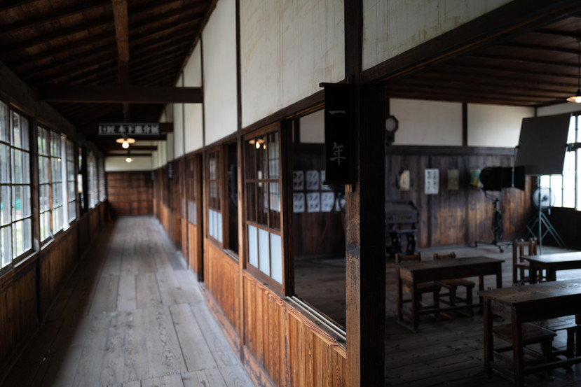
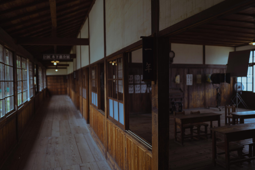
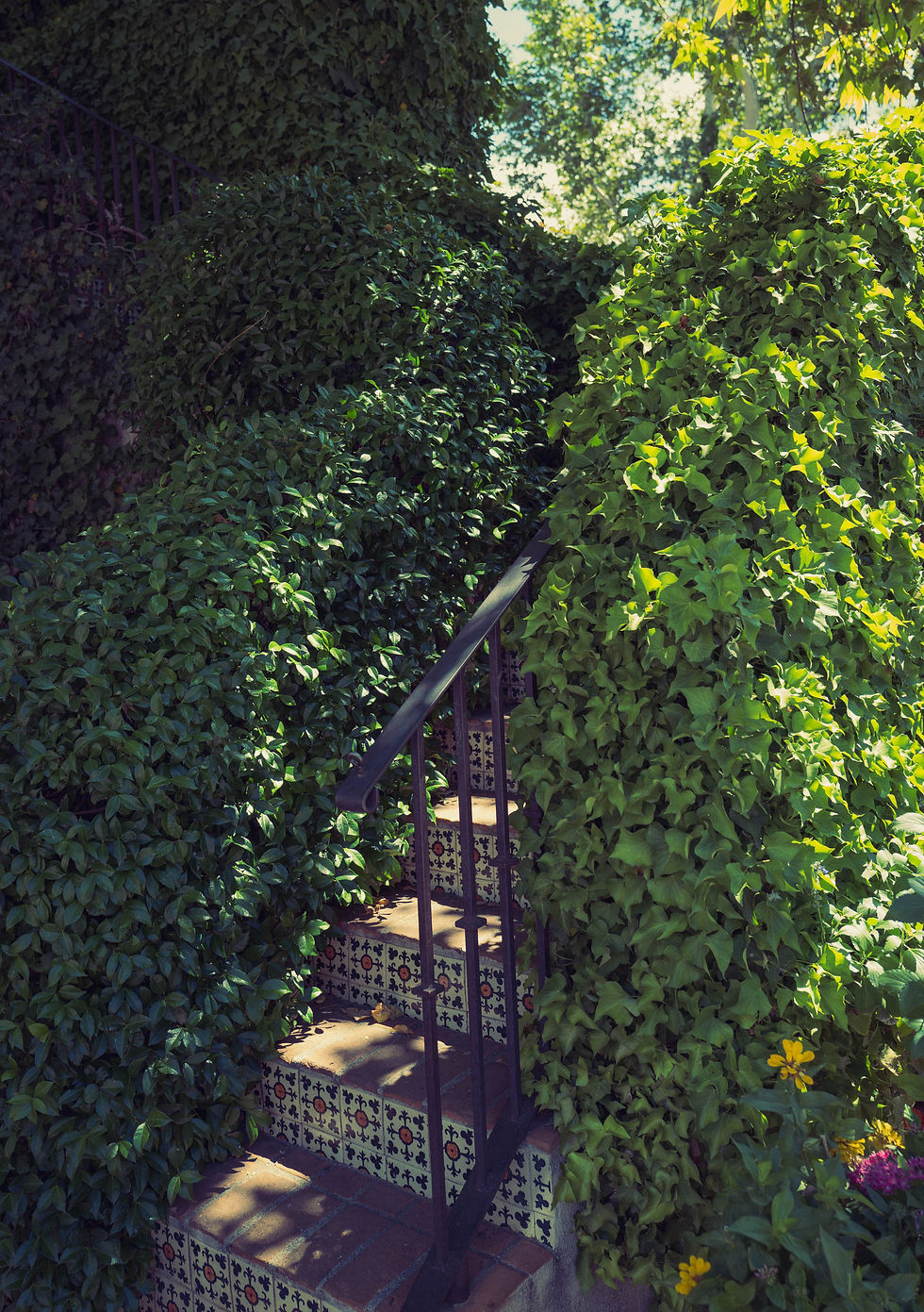
Just to show off some of the presets I worked out (two of which following video tutorials in Chinese called 青山摄影), and how different one image could end up. The follow is w/o edit, and three with different presets.


Comments